EDIT: The categories are currently mocked; Looking for help assigning proper categories to all factory presets. PN me if you’d like to contribute.
(I’ve posted this on reddit a few days ago and want to gather more feedback ![]() )
)
The Fields biggest strength for me is that it keeps me in the moment, it keeps me making music; committing; going forward. This concept is challenged, if not broken, when it comes to the current preset browser.
The problem
No matter your workflow, at some point you probably think “a plucked arpeggio could spice things up” or “I feel like starting with some pads today” or “this needs some bass!”. Field has over 200 factory presets and even if you know all the bass patches by heart, do you know which engine/folder they are in? Some people, including me (surprise!), get taken out of the experience searching for a preset. While this is a problem with digital music production in general, it can be improved upon immensely by just two things: Favorites & Categories
The goal
I wanted to see if this can be done properly on a small machine like the Field and it was clear quite quickly that this cannot be explored with pen and paper alone. So I made a prototype! Without actually knowing TEs design philosophy or reasoning behind certain decisions, I tried to built upon the existing browser and only use existing mechanics and ui elements.
The prototype
It’s a Web-App built with Nuxt3 and can be used with MOUSE, KEYBOARD and with your Field directly using MIDI (!)
Usage
- Tested only on latest Chrome on latest macOS
- Connect Field via BLE or cable;
- Since Fields SHIFT button does not send MIDI, we treat STOP as a replacement
- So… STOP = SHIFT
- Or Hold Shift on your computer keyboard
- In-Browser encoders can be dragged up, down, left and right
- If you need any more instructions from here, it means my design failed. Please let me know

Setup Field MIDI
- press SHIFT + COM
- press T1 for MIDI settings
- set OTHER to OUT (or BOTH)
- press T1 to get back
- press T2 for CTRL
- hold SHIFT and turn ochre to KNOB to REL
Design principle
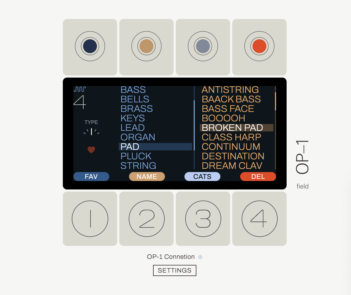
Fields Encoders always (?) manipulate the corresponding color on the screen. The prototype stays true to that. It can also be seen as the encoders all work together to select a preset. The T-Buttons on the other hand interact with the currently selected preset.
New Features
- Mark and unmark any preset as favorite (FAV)
- Show only Favorited presets
- Change between different Filter Types (different blue lists)
- i.e. filter by Categories (CATS)
- Assign Categories to user presets
- Faster scroll by holding SHIFT
- Loop through Lists
- Moving user presets
- Managing user folders
You’re still reading this? Nice! From here on I’ll dive deeper into the new features.
FAVs
- Favorites are pretty straight forward. Every preset either is or is not marked as a favorite.
- Turning Orange knob activates Favs-Only-Filter and narrows the ochre preset list down even further
- With Favs-Only-Filter some blue filter items might no longer hold any presets.
- I could not decide wether to hide empty filter items or disable them and added a setting for that.
- When empty items are disabled, user cannot select them and scrolls right past them.
CATS
- There is a predefined list of categories (Bass, Brass, Lead, Pad, Pluck etc.)
- Presets can be assigned to 0 or all categories
- Only on custom presets User can change the assigned categories
- The list of available categories is fixed. User cannot rename, remove or add categories
- To provide some customizability, there are 4 empty user categories (USER1, USER2, …)
- The categories are mocked. I lack the musical expertise (and time) to choose appropriate categories and categorize all presets properly. If anybody wants to contribute and refine the categories and assignments of factory presets: I can invite you to a Google spreadsheet
FILTER TYPES
- On vanilla Field there is one blue list, filtering all available presets by Engine (and also user folders, … more on that later)
- The prototype has more than one “blue list”
- Each blue list is called a filter type, holding filter items
- Gray knob cycles through filter types
FINAL FILTER TYPES
Deciding on the final filter types posed more challenging than expected. Vanilla Field contains filters for synth engines AND user folders. While working on the project I felt more and more that this behavior isn’t consequent enough compared to the other filter types. In Alphabet, Cat and Misc all blue items follow a similar pattern, whereas in vanilla a user folder might hold a preset with synth CLUSTER but is not represented in the blue item CLUSTER.
I fear removing / changing the vanilla behavior deviates too much and will surely disappoint some users, while adding on top of what’s already there is less likely to cause disappointment. Therefore I provided both versions with vanilla behavior as the default in the settings. The default remains combining factory presets in engine items and user presets in folder items, although I personally prefer splitting them apart.
But… how exactly do you split them apart? Adding another filter type with all USER presets is obvious. It holds each folder as a blue item, i.e. SNAPSHOTS, OP1FUN, BESTOFCCKOO etc. – Without the user presets, the vanilla blue list filters by Engine only, which I find great. But… should the new ENGINE filters also hold user presets with the same engine? Or is it more of a “Factory and Engine” filter?
I ultimately opted for the latter, because I can’t imagine anybody searching for a preset with thoughts like “I’m looking for something that sounds cluster-esc”. But… it would be more consequent to include them… As you can see, I’m torn apart on this, which is why I added a setting toggling between both. Excited for your thoughts on this.
T-BUTTONS &ENCODER CLICKS
- I deliberately not included encoder clicks doing the same as their T-button counterparts, because I think encoder clicks hold a lot of potential for power users and get not used enough
- Lack of visual indication on what happens by clicking encoders is a user experience problem. But although the screen is more esthetic with less visual T-Buttons, and although my nerdy power-user-brain loves encoder clicks, I ultimately chose stronger UX and tried to avoid encoder clicks in favor of labeled T-Buttons
- That being said: When encoder clicks would be utilized more often throughout the entire machine, I argue the user can learn and get a feeling for what clicks do. If the click function is tightly coupled to what turning does, it can be natural to use clicks. Example: Gray turn cycles through CatsEditList, then Gray Click toggles the selected cat
FAST SCROLL
- A bit of context for those who don’t know – Fields encoders are clicky when turning. Often throughout the ui not every click results in an action. In Preset browser for instance Field does only move to the next item every 4 clicks.
- This is often too slow for my taste. This got particularly annoying in ABC or MISC filter types, where the ochre list of presets can become very long.
- In the prototype holding SHIFT while turning encoders triggers the action on every turn-click, which naturally results in faster scrolling.
- I personally prefer faster scrolling a lot and would like to have it as the default or see a global option for that. But until then, the prototype provides this functionality while holding SHIFT.
- Remember: Fields SHIFT button does not send MIDI, so for this prototype Fields STOP button poses as a substitute. During testing, I often hit the actual SHIFT button and turned ochre, which messes up the settings necessary for the prototype to work.
LIST LOOP
Surely there’s a reason why TE did not do this, but I wanted to see how it feels to go from the first to last item and vice versa.
CATS EDIT MENU
- I designed this menu analog to the delete confirm menu: Orange “Ok”, Gray: “Cancel” (although I personally see cancel as red/orange)
- I chose the blue button for toggling cats analog to the fav toggle button; felt right to establish one button as the main “toggler”. That’s also reflected in a similar naming scheme (FAV/UNFAV, CAT/UNCAT)
- User might feel the habit to turn blue encoder for navigating left sided list. So I opted to make catsEditList scroll by both gray and blue. Vanilla field does the same with switching presets on ochre, gray AND orange. And heck, while I was at it, why not bind it to all encoders?
- I couldn’t resist to utilize encoder click for toggling cats as well. It is very efficient when CATing many presets and just feels natural
MANAGING USER PRESETS AND FOLDERS
- Field introduced us to naming user presets right on the machine! AWESOME!
- But moving them from SNAPSHOTS to another folder still required a computer
- The prototype adds moving between existing folders with SHIFT + T2
- To be completely independent from a computer, creating, naming and deleting folders can also be done in the prototype.
- It’s crowded though… DEL button for deleting folders is hidden yet again behind SHIFT; Folders can only be deleted when they are empty; using SHIFT for different menu items is not straight forward or intuitive. But Honestly? A lot of things must be learned on the Field, so for me using SHIFT is good enough when it removes the need for a computer when it comes to preset management.
FAV INDICATORIN PRESET LIST
- It would be nice to see on a glance which preset is a favorite and which isn’t
- I couldn’t decide on a visual indicator and added a setting for that
Did I feature creep?
I can see people feeling this concept packs too much and isn’t really the TE way. I get that and certainly do not NEED all these features. Many can be committed without hurting the main idea. Here is what I think is actually necessary for staying in the moment, because you just find your next sound quicker and easier.
- Favorites
- Categories
- an additional blue list filtering presets by category
- filtering by favorites
What I am not happy with
- My fav indicators in preset list are just not good😄
- While I learned to like the filter type indicator, the Favs-Only-Filter-Indicator is just a heart and doesn’t really scream: “Turn orange to switch me on!”
- When blue items are disabled, you cannot select them, which sometimes makes scrolling feel like its broken. You want to scroll up to A in ABC, but you can’t cause it’s disabled.
- I had to rename PIZZICATO because there are actually 2 of them. One in DIMENSION, one in PULSE. Presets with the same name broke the prototypes logic while navigating.
What’s next?
- I’d like add proper categories to all presets, but would need help for that.

- I hope you guys like this prototype and agree with me that the process of finding presets can be approved. Maybe this thread can raise awareness at TE that there’s demand for a richer browsing experience.
This project kept growing and was a lot of fun. Not just did I learn a ton about Nuxt3 and the OP-1 itself, but also found a concept which I think improves the process of finding a preset without deviating too much from the vanilla approach.
As you can tell, I’m pretty excited about this. And also proud. I’m excited to read what you guys think about this!