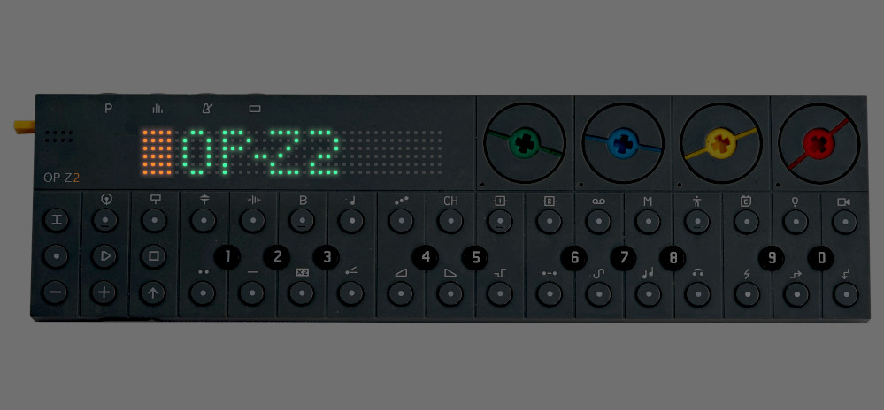
I had an idea for a product I made a mockuo for an OP-Z field.
Instead of the screen and knobs, it is a simple dot matrix display.
I have visualised it here with the lights glowing in the dark.
This design retains these features that I value in the OP-Z:
1: Encoder dials are flat and turning them with the tip of your index finger, allows you to turn them very fast or very slowly with ease.
2: There is no menu diving as the lights and colours combined with shift keys removed the need for menus.
3: This machine can be played in relative darkness due to the glowing lights and colour coding, which aids in finding the right button.
4: The speed of selecting tracks and mute groups makes altering compositions in real time without getting confused and performing musical improvisations are more well suited to the form factor and reduced number and shape of buttons.
5: Elegant simplicity is the hallmark of this product, which is a winning formula, IKEA will attest to. The rows and grids of buttons and only one shape and font and size with the colour ways are a real inspiration when music creating. This is something all product designers aim for in creating a mass appeal product and instrument.
The marriage of form and function are key.
Also the light show is cool. Why not extend that dmx pattern channel a bit and add animation to this matrix display?
So I hope you like my visualisation of the OP-Z2, which would be a beefier OP-Z in terms of tech and features as well and the multi colour matrix display would be a great challenge for the designers and eye catching feature.
Also make the pitch bend more sensitive.
Thanks!
I’d like to add that it’s very difficult to remember the setting for each trigger event with 10 options for each which would help immensely to have displayed for clarity and not needing a cheat sheet.
Why not divulge some commands? As the published online manual misses a whole range of features only found on youtube videos.