OP-1: Super Serious Design Discussion with Super Serious People

In another thread, Protoyper1, a mechanical engineer, has been talking extensively about the design of the PO cases. Given his/her knowledge I wondered if he'd be interest in discussing the OP-1's design as well. Thankfully, he obliged, and asked me to start the discussion.

I love design--and I know nothing about the technical aspect of design. So I'm not sure how to begin the discussion. I've listed some potential topics that Protoyper1, and anyone who happens to have design expertise, can address. And even better, talk about anything you think worth consideration. TE has, inarguably and understandably, a larger demographic than other music instrument companies that cares about sound and design. Most of us know more about how our beloved synths work than how they're designed. Maybe this can be a place to learn more on the latter.


- A really broad subject: what do you think are exceptional points of the OP-1's design? And more interestingly, what are the weaker points?
- Could you speak to the type(s) of plastic used in the OP-1? The plastic buttons/keybed feel and sound really great. So much so, initially, I wondered if it could be thin metal. I had a similar experience with Native Instruments' Maschine Studio. There's a few areas where the plastic is so rigid and dense, I wondered if a lower grade of metal is used.
In contrast, the plastic buttons on Elektron instruments sound and feel much cheaper. You don't actually need to own one to hear that they feel cheaper. When you watch demo vids, you can hear the unfortunately high-pitch tick of each plastic button being depressed. Although that may have something to do with the mechanisms used for depression, not just the plastic.
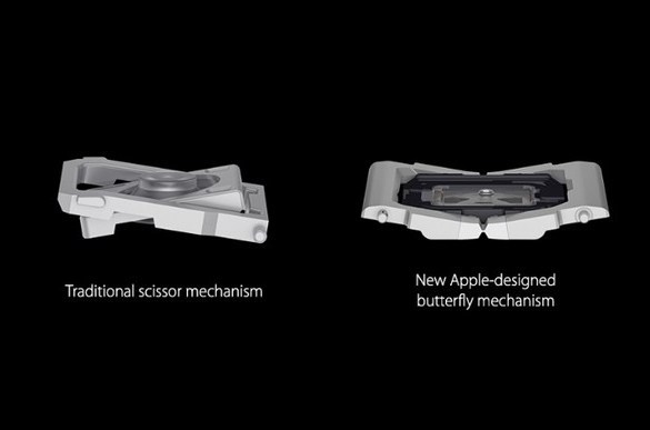
- The keys (even the elongated B-, D- G- and E-flat) depress quite evenly, whether you press the key on the extreme left/right or top/bottom. By comparison, if you do the same on the perfectly square keys on any computer keyboard, they do not depress evenly. The exception would be the new Apple Macbook where they're using a "butterfly mechanism" for even depression across the entire button--and they claim it's new. Is there something similar in the OP-1?


- Anything to say about the grade/finish of the aluminum unibody?
- What do you speculate are the most expensive components of the OP-1?
- What are examples of where they went all out for quality and where they made compromises?
- Besides the packaging, is there anything that appears eco-conscious?
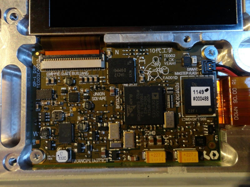
- Like Apple, TE takes an aesthetically holistic approach to design. The innards, visible to no one, still need to be considered as much as the exterior. But TE takes it further, by extending their sense of fun and levity to the PCB, turning it into a map of some downtown somewhere. No question--just an excuse to share this:


The feel of keys depends on the amount of reaction force generated when you press them down - in other words, the amount of force you feel. This is determined by the mechanism as your images show. So, these mechanisms use springs and levers to generate the force you feel. As the levers swing, the force you feel changes throughout the arc. A different mechanism or just changing the geometry of the levers will create a different feel.

I haven’t looked closely at laptop keyboard lever mechanisms, but now you have intrigued me. I’m not crazy about any laptop keys. I have a desktop keyboard plugged into my laptop 99% of the time

Also, while I was away from this site, I found some really interested discussions about music keyboard feel and expressiveness. For example, Vangelis attributes a great deal of his unique “sound” to the unique keyboard of the CS-80, and not so much to its sounds. Though, I have to say, the CS80 is one of the fattest sounding, and smoothest sounding I have heard at the low end. Jupiter-4 is my other favorite for sound. (sorry, that’s a tangent).


and here’s a more accessible alternative to buying a CS-80
http://www.synthtopia.com/content/2013/07/29/touchkeys-promises-to-add-multi-touch-expression-to-your-existing-keyboard/

So my point here is that the feel of an instrument, tool, or whatever it is you are doing something significant with is more important than most people realize. Its only in the past few years that I have really put a lot more emphasis on this in my thinking about design. Another example: I have a sports car (another hobby of mine is modifying cars). Its not the fastest/quickest car. Its not the flashiest, nor is it expensive. But when I drive it, it makes me feel alive. I can feel every road imperfection. The engine is super responsive (if driven correctly). The trans - well the shifter feel could use some work, but I might know what to do about that. The car itself almost feels alive because its so responsive in all areas, handling, braking, engine, steering. Its an absolute joy to drive. And when I drive it, I really DRIVE it. By contrast, my wife’s SUV is quieter, more comfortable, and ultimately, very boring. Not much feel there either. Great for long trips. My sports car is not so good for long trips - too hard edged.


Something else to consider is the visual design of the screen output on the OP-1. This is a big part of the experience. I can only comment on the mechanical (physical) aspects of the design. It would be great if a UI designer could join this discussion. A PCB/electronics designer might be handy as well.


Thanks for taking the time to explain the engineering side of things @Prototyper1, really interesting to read. Another great thread idea @libertinelush! My day job is design, some of which involves UI. Looking at the OP-1 from a this point of view its difficult not to be impressed with the final outcome. Here is a few lunch break thoughts on the UI:


Display size: One of the complaints about Elektron gear (which Teenage Engineering had a hand it designing) is the tiny screen and menu-diving. In order to create something intuitive and fun they’ve reversed this idea - the screen is the hub of the front panel, everything runs through it in some way.


Resolution/frame rate: The OP-1 lives or dies by the success of the screen. TE know this, hence the quality of resolution and (generally) smooth framerate. The importance of the framerate cannot be overstated - much like Protoyper1 outlined the importance of ‘feel’ with the keys, the responsiveness onscreen needs to link directly with both the feel and the sound.


Direct graphical interface/UI - philosophy: Larger screen means more real estate which also means less words/descriptions required. In order for the OP-1 to be an intuitive & accessible the best possible way to achieve this is to remove as much written language as possible. Words are signposts or instructions, graphics act more like semiotics - becoming a language of their own using universals that everyone can understand. The visual language all hinges around the colour-coding. We see this all around us a lot - subway systems, brand identities, the internet etc. One of the best comparisons for the OP-1 is probably computer games. The UI for games also does away with conventional language. Look at a Playstation controller as a prime example - the buttons are shapes. When you play a game, all button presses and movements are displayed to you via visual information on the screen. This could be anything from a moving character to a visual indicator of how many lives you have left, mini-maps, items you can pick up etc. From my viewpoint it looks like TE have embraced this approach from the outset. You can give a computer game to 100 different people in 100 different countries and they will all grasp what is going on as there is no (or very little) language barrier, rather its a shared language that has been defined by the UI.


Direct graphical interface/UI - in practice: So how does this work in reality? This is where some of the practical side comes back in to play. Great design is where form and function meet as equals and the screen/UI of the OP-1 is exactly this. Although there is a wide range graphics they all share the same themes (or branding to a point) - based on a four colour code rendered in a minimal design style. The latter part is very important as it serves two main functions. Firstly it clears away everything that is unnecessary so that only the basics are present and focus is maximised (there is a certain understated elegance in these designs that is also mirrored by the physical unit itself - again form & function united). The second reason is down to frame rates - simple graphics equals smoother response to touch tying it more to the tactility of the control set.


As for the designs themselves, they have all been treated like a series of micro brands with common attributes - both colours and weights of line stroke. There is a uniformity across all the designs that still allows them so freedom of expression without breaking the unspoken formula (CWO being a prime example). The comparison with Apple is, for me, a valid one - here is another company who’s goal is to remove everything but the basics to create a clean, elegant environment. The main difference is the the OP-1 is just more fun in spirit they remind me of those pocket Nintendo games from the 80’s (where the graphics were also very simple but for limitation reasons).


One of the criticism levelled at the OP-1 is that its an expensive toy. I think on some levels this means that TE have succeeded. It looks like a toy when you see pictures. Having one in your hands makes the experience is very different. The weight and coldness are the first give-aways. Then you turn it on and see what is probably one the best hardware display on a musical device. After than you realise how responsive the graphics are to the controls and because of the friendly, open UI, its inviting to use. There is a whole world in that little box but it never feels intimidating. Inside and outside are designed with the same vision and its very rare that we see all aspects of design pulling so cohesively in the same direction.

@wolflegjon is spot on.

As a side note, the OP-1 graphics remind me of the NORAD screens in War Games…
http://www.hp9845.net/9845/software/screenart/wargames/

The 80’s game aesthetic brings so much fun and personality to the device, and the line weight and color consistency throughout really pulls everything together brilliantly. You can tell the UI designers at TE put a lot of love into this little monster.

@zzzach great link to War Games visuals, hits a nail on the head! Its so linked I’m now wondering what happens when we use our OP-1s…


Totally agree, there has been a lot of time and love been put into this little box, I’d love to see the initial sketches and ideas for the OP-1.
The feel of keys depends on the amount of reaction force generated when you press them down - in other words, the amount of force you feel. This is determined by the mechanism as your images show. So, these mechanisms use springs and levers to generate the force you feel. As the levers swing, the force you feel changes throughout the arc. A different mechanism or just changing the geometry of the levers will create a different feel.

Does the mechanism used affect the tone of the plastic depression sound more than the type of plastic used?

Also, while I was away from this site, I found some really interested discussions about music keyboard feel and expressiveness. For example, Vangelis attributes a great deal of his unique “sound” to the unique keyboard of the CS-80, and not so much to its sounds.
So my point here is that the feel of an instrument, tool, or whatever it is you are doing something significant with is more important than most people realize.

I carry that same conviction. And it’s conviction that reliably renders disappoint in me, because hardly any synth/keyboard controller company makes a keybed that’s exceptional, no matter the price.


My Moog Sub 37, their flagship Phatty, features a keybed that does something really special. It excels in how cheap it feels, looks and sounds—the keys carry uneven depression pressure and they’re affixed too loosely; you can see the internal mechanisms through the oddily wide slits between the keys and where the top of the keys meet the front panel; and they are loud enough to be its own drum machine. It should not be that my Native Instruments’ keyboard controller, beginning at prices 1/3 of the Moog, has a much superior keybed.

I think the import of keybeds is very devalued in our collective expectactions, partly evidenced by the absence of any criticism of the Sub 37’s keybed in official and customer reviews.

Do you know what was special about the CS-80 keybed?

I love the OP-1’s keybed. I don’t know much bias plays a role in my affection for it, but it feels really good and joyful to play on it, despite my pianist background and preference for hammer-action keys.

and here’s a more accessible alternative to buying a CS-80
http://www.synthtopia.com/content/2013/07/29/touchkeys-promises-to-add-multi-touch-expression-to-your-existing-keyboard/
That looks incredible. I hope other makers adopt it, driving down the prices for it.

I looked at that inventor's Youtube channel and found this:
Continuous note shaping on the acoustic piano

Also really compelling. Like the TouchKeys, but works on an acoustic instrument.

Display size: One of the complaints about Elektron gear (which Teenage Engineering had a hand it designing) is the tiny screen and menu-diving. In order to create something intuitive and fun they’ve reversed this idea - the screen is the hub of the front panel, everything runs through it in some way.

I recently got the Analog Four. I love it, so much. But there are so many design flaws, especially in the build quality and materials used. The screen is certainly too small. The resolution is far too regressive at it’s price point. Unless you can take a Pocket Operator-like approach, in which the low resolution is not an impediment, instead a contributor to its aesthetic imperative, give us more pixels.


Direct graphical interface/UI - philosophy: Larger screen means more real estate which also means less words/descriptions required. In order for the OP-1 to be an intuitive & accessible the best possible way to achieve this is to remove as much written language as possible. Words are signposts or instructions, graphics act more like semiotics - becoming a language of their own using universals that everyone can understand.

This is partly why I think the OP-1 may be the most accessible, and for me, the most thoroughly engaging, synthesizer ever made. The visual metaphors, when at their best (String and Dr. Wave engines), relay intuitable information. You may not understand what the parameters are doing, when tweaked, from a technical perspective, but the visuals suggest to you what’s being done symbolically. Semiotics can be far more illustrative and instructive.


But when symbolism isn’t elucidative (Digital, Cluster engines), it doesn’t transcend the limitations of language and becomes more opaque than a foreign language. Cluster is one of my favorite engines for its sound. I like that it functions like a subtractive synth. But I couldn’t intuit what some of the parameters were doing without a great post elsewhere in this forum. The White and Red encoders do not change the oscillators below in a comprehensible way.

The comparison with Apple is, for me, a valid one - here is another company who’s goal is to remove everything but the basics to create a clean, elegant environment. The main difference is the the OP-1 is just more fun in spirit

TE also does some things better than Apple.


The internals of Apple products do not have fun of the OP-1, as evidenced by the image above. And given the puritan tendencies under Jobs’ reign, the “Fuck Yeah!” at the top right of the PCB wouldn’t have been allowed. At most, it would be, "Yeah!"

And TE does skeuomorphism better–something that Apple has been rightly mocked for so long. Thankfully, Jonathan Ives has done away with most of the skeuomorphism that Scott Forstall implemented and Jobs’ favored. I don’t know when/if skeuomorphism really has a place—in certain genres (RPGs, MMORPGs) of video games, I wonder if it serves an importance purpose, in further grounding it in that world—but the OP-1 makes a good case for it. Tape and Album are very charming.


As for the designs themselves, they have all been treated like a series of micro brands with common attributes - both colours and weights of line stroke.

Is stroke weight the term for the thickness of typefaces? I love how it’s done in the Endless sequencer.


The Ableton Push is also one of the few examples in music instruments where I think they chose a stroke weight that works:


I really enjoyed reading your insights, @wolflegjon.
@wolflegjon is spot on.

As a side note, the OP-1 graphics remind me of the NORAD screens in War Games…
http://www.hp9845.net/9845/software/screenart/wargames/

That’s really interesting!


I’m back to work in the morning- this was a 4 day weekend for me as I took last friday as a vacation day, so I will post more elaborate responses soon.

In the meanwhile:

"Does the mechanism used affect the tone of the plastic depression sound more than the type of plastic used?"
1) The sound of the keys is affected by everything: the type of plastic used, the mechanism, the spring, the molded shape of a key (hollow, not hallow), the geometry of the key (3D shape), and so on. A designer could add a rubber/silicone bumper for the key to bottom out on making is less “clacky” if she/he wanted. I recall reading about 1980’s IBM PC keyboards. They were super clacky, but very responsive and good feeling. They were just very noisy. My $20 PC keyboard at work is not as noisy as my $50 PC keyboard at home, but I definetly prefer my own keyboard, plus its ergo - bent to match my arm angles when typing.

2) "I
carry that same conviction. And it’s conviction that reliably renders
disappoint in me, because hardly any synth/keyboard controller company
makes a keybed that’s exceptional, no matter the price.
Do you know what was special about the CS-80 keybed?"

Polyphonic aftertouch (on 8 voices, with 2 osc per voice!)- vibrato - on each key!, velocity sensitive, all on one keyboard. That’s why I was interested to find the touchkeys project.

3) "
That looks incredible. I hope other makers adopt it, driving down the prices for it. Linn (Linnstrument) is doing midi controllers that respond to vibrato.


I looked at that inventor’s Youtube channel and found this:
Continuous note shaping on the acoustic piano
Also really compelling. Like the TouchKeys, but works on an acoustic instrument."

I also hope TouchKeys becomes more popular. I saw his magnetic resonator piano as well, and I find the sound extremely pleasant. Very natural sounding.


@libertinelush Both the stroke weights of lines and weights of fonts have clearly been looked at a great deal. The font for endless is great, its a little bit Helvetic in places but taller and with deeper curves - the form factor is much more playful as its another way of taking a traditional thing and putting a twist on it.


The illustrations are (for the most part) constructed from 3-4 set thickness of lines - working with a limited range combined with the colour coding goes a long way into making it really cohesive. They can do wild things (like CWO) because of this. Admittedly some screens work better than others at conveying whats is happening but they are all very responsive graphically/tactile wise and most importantly fun.

The skeuomorphism point you brought up is interesting. I think I can see why Apple used it when the iPhone was taking off - it was a way to communicate what all these new app things where by making something visually recognisable within the new environment/tech. They can comfortably go the other way now though, most people are familiar now because of this. Personally I never cared much for skeuomorphism as it lacks expression and certainly seems to be non-progressive from a design point of view.

"Does the mechanism used affect the tone of the plastic depression sound more than the type of plastic used?"
1) The sound of the keys is affected by everything: the type of plastic used, the mechanism, the spring, the molded shape of a key (hollow, not hallow), the geometry of the key (3D shape), and so on. A designer could add a rubber/silicone bumper for the key to bottom out on making is less "clacky" if she/he wanted.

That’s wonderful to know about. I like learning stuff that like.


The font for endless is great, its a little bit Helvetic in places but taller and with deeper curves - the form factor is much more playful as its another way of taking a traditional thing and putting a twist on it.


Yea, that’s it. Elegant, but also playful.

Personally I never cared much for skeuomorphism as it lacks expression and certainly seems to be non-progressive from a design point of view.


I agree. I think art and artists need to aspire to values and possibilities of the future. Skeuomorphism is embracement of tradition and the past—it challenges and questions nothing.

@libertinelush I couldn’t agree more with your last sentence. The dividing line between art and design is very thin these days and there are more risks that can be taken from both sides to blur that further.

The battery is something that is very important, I believe.

I think I read somewhere that many choices were driven by the fact that they should not draw the battery too quickly.
And an OP-1 with only 1 or 2 hours of power would not be the same.

The design not only present in the physical aspect of the OP-1 : it also lies in the way it let you synthesize sound for instance.
I’ve never seen an FM synth so easy to control !

In general, as it was said, the screen is the aspect I really love in the OP-1.
Not only because it is really beautiful, pleasant to see, not hurting the eyes and big enough.
Not only because the interface is thought so that the link between colors and knobs is almost always present…
But also because it is from here that comes the most FUN !!! BTW : a game ? Who hides easter eggs in synths nowadays ?

@lyingdalai fully agree about the battery for a design/function point of view…


I’ve only tried the Helicopter game once and although I’m terrible at it and its arguably frivolous I like that its there. Hell, I’d much rather that the VL-Tones’s calculator!

There is an academic paper written on the usability of the op-1. Only the abstract is in english i’m afraid…

http://www.diva-portal.org/smash/get/diva2:413933/FULLTEXT01.pdf